Color
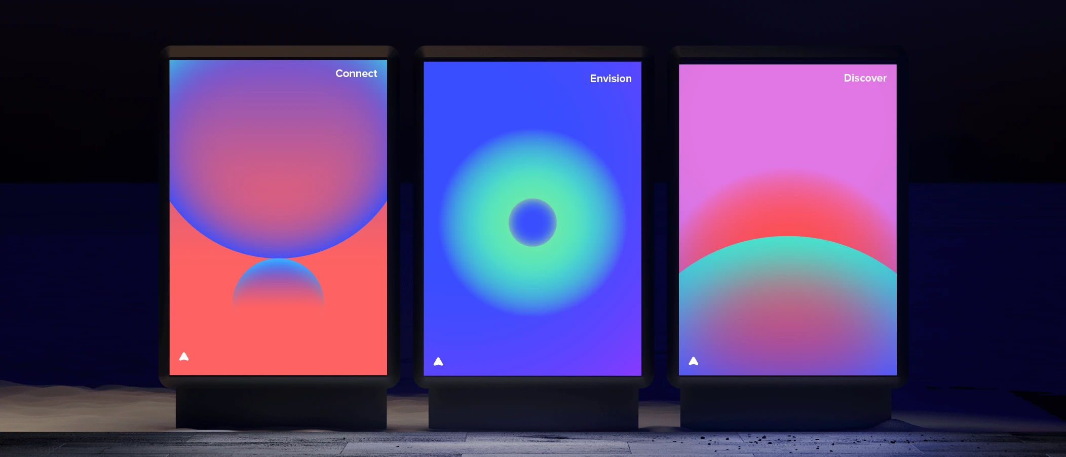
Colors are a key element of Spaceship’s brand identity. Consistent brand color usage across communications, from visual asset creation and corporate materials to merchandising, is essential.

Spaceship’s brand colors were chosen to create a strong sense of harmony and range in our brand expression.
Brand main colors
We created SPS Blue and SPS Dark Gray specifically for the brand’s main color palette. SPS Blue is the predominant color, and SPS Dark Gray represents the more neutral side of the brand.
Brand auxiliary colors
The auxiliary palette expands our brand’s personality even further. These corresponding tones are in proximity to SPS Blue and include a range from both the cold and warm sides of the color spectrum. This creates harmony with the brand’s foundational colors.
Tints and shades
Our system is built with a base colour and matching shade and tint variations. Each colour also has dedicated palettes for light and dark modes. These were adjusted in detail to allow assets to adapt and integrate better with a specific mode.