Core Products
Distinct yet cohesive, our core products showcase unique brand elements while remaining anchored by Spaceship’s master brand.
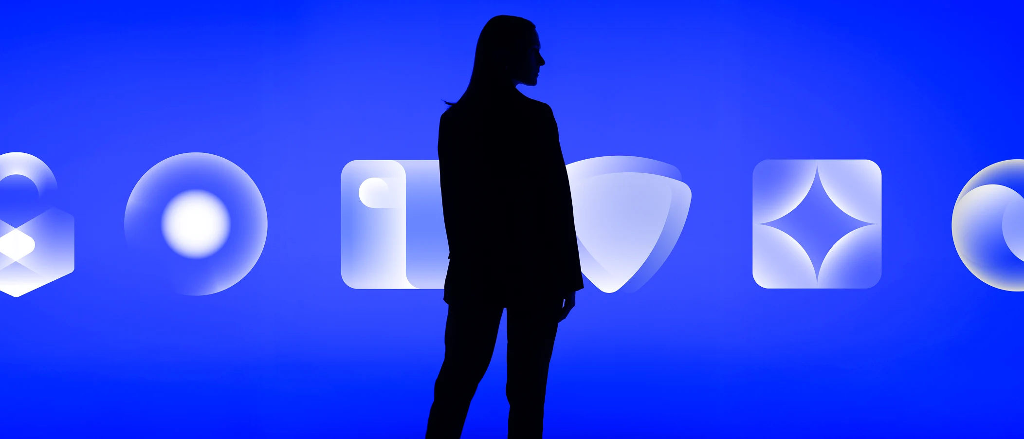
Brand architecture
Spaceship’s products are organized by categories. Because every product has different selling points or target audiences, it’s vital that they are easily distinguishable while maintaining cohesiveness within the product ecosystem.
That’s why each category within our brand architecture has a distinct identity that always relates back to the main Spaceship brand. Within these categories, core products respond to their parent category.
Color and other visual elements play a key role. Each category has a main and secondary color, as well as specific and versatile icons, photography, and more. Foundational creative concepts distinct to each category also guide the direction of visual representations.
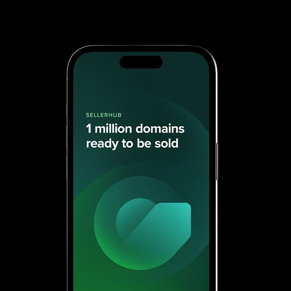
Domains
The Domains category is represented by a core shape, symbolizing a central point from which everything can grow. Creative concept:
The origin and expansion of everything


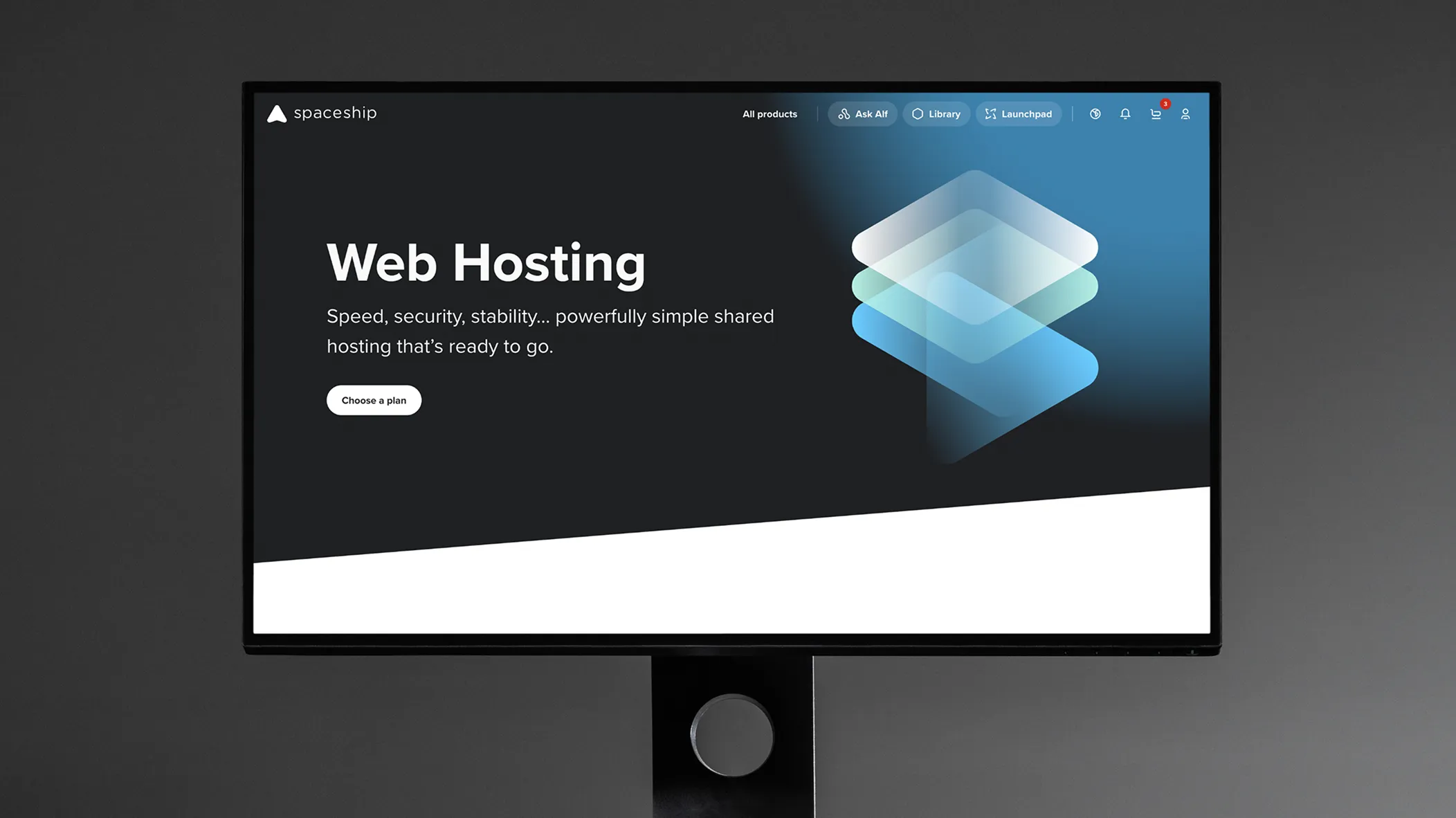
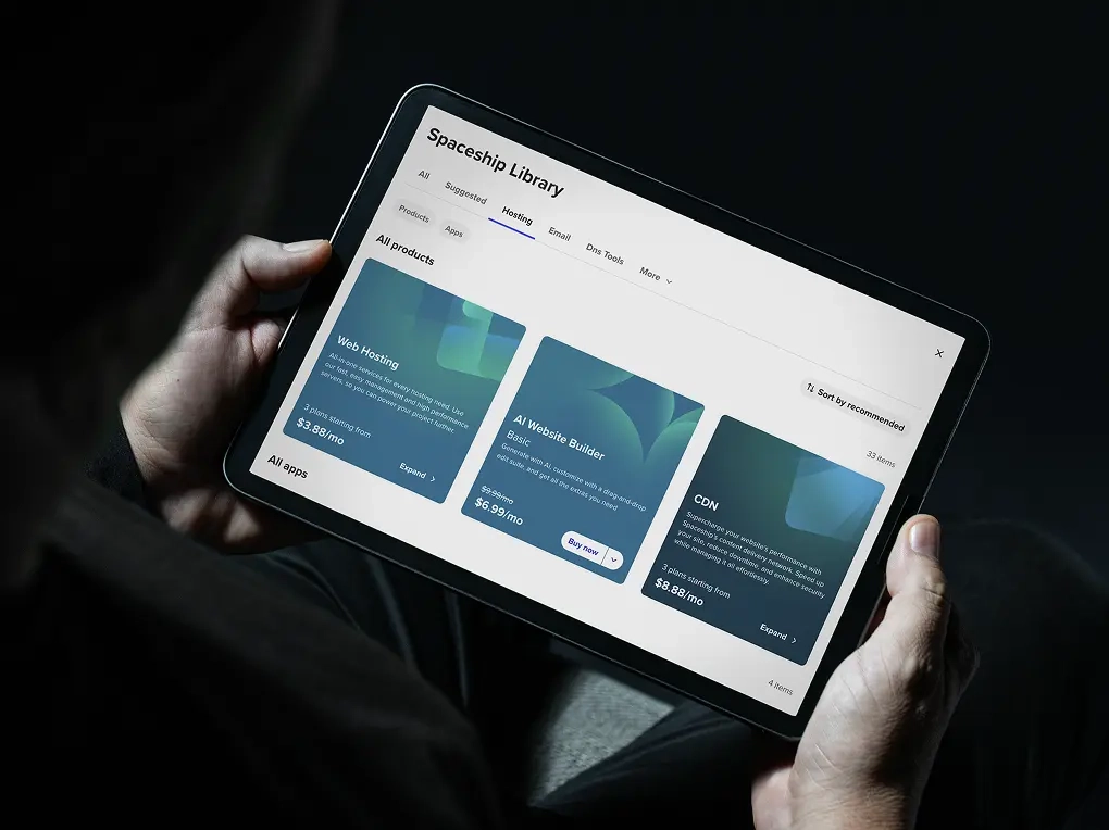
Hosting
The Hosting category is represented by a vertical server, symbolizing the source of empowerment available for everyone with a digital presence. Creative concept:
The power that sustains everything


Security
The Security category is represented by a continuous shield that symbolizes protection and privacy. Creative concept:
The freedom to prosper through safety


Guidance
Here are some examples of what to avoid when using category and core product-related visuals.

Do not change the core products’ visual representation.

Core products are not brands, so don’t use their representations as logos.

Do not mix colors from different products or other palettes.