Icone
Le icone di Spaceship traducono azioni e idee complesse in simboli immediatamente riconoscibili, aiutando gli utenti a navigare e interagire con facilità.

Universali ma distintive, le nostre icone sono i più piccoli elementi costitutivi del brand, progettate per essere immediatamente riconoscibili pur mantenendo chiaramente l'identità di Spaceship.
Versioni
Tutte le icone Spaceship sono disponibili in due versioni: contorno (primaria) e piena (secondaria).


Costruzione
Le icone sono progettate secondo regole definite — dalla griglia di base ai parametri del tratto — garantendo risultati coerenti ed equilibrati.

Dimensione
Progettate per essere scalabili, le icone dovrebbero essere utilizzate in cinque dimensioni per preservare chiarezza e armonia visiva in tutto il sistema.

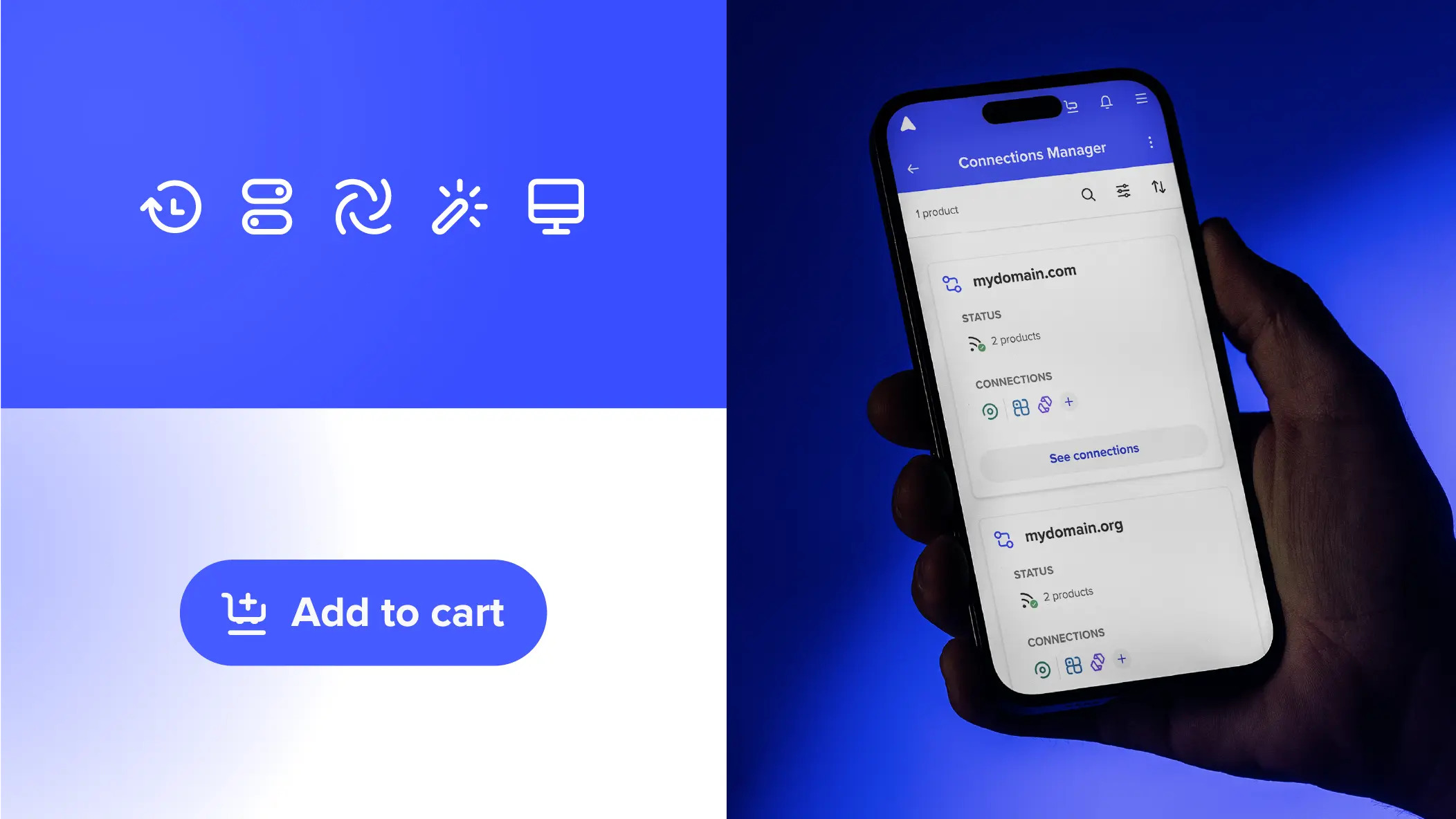
Colori
Il colore è un elemento essenziale che aiuta gli utenti a identificare più facilmente i propri prodotti all'interno di una determinata interfaccia. Per garantire coerenza in questi contesti UI, le icone utilizzano i colori del Spaceship Design System.
Colori del brand
Essendo i colori principali di Spaceship, questi dovrebbero essere la scelta primaria per le icone — sia in contesti funzionali come l'interfaccia della piattaforma sia in usi più illustrativi, come la rappresentazione delle funzionalità nelle pagine prodotto. Consulta la pagina dei colori per ulteriori dettagli.
Colori del prodotto
I colori principali di un prodotto dovrebbero essere applicati alle relative icone. Questo è fondamentale per il riconoscimento e la consapevolezza del prodotto all'interno dell'ecosistema Spaceship.
Colori di notifica
Usa i colori di notifica per rafforzare i messaggi di avviso. Dovrebbero essere applicati solo alle icone di avviso, con occasionali eccezioni in cui un'altra icona rappresenta anche stati di successo, errore o avvertimento.
Guida
Ecco alcuni esempi di cosa evitare quando si usano le icone.

Non distorcere, ruotare o capovolgere le icone. Ridimensiona sempre in modo proporzionale.

Non utilizzare icone più grandi di 40x40px. Cerca l'equilibrio tra gli elementi.

Non utilizzare tinte o sfumature.