Ideografie
Spaceship folosește ideograme pentru a transmite idei simple și clare. Evităm narațiunile complexe sau reprezentările literale, concentrându-ne în schimb pe sensul de bază al mesajului exprimat prin geometrie și mișcare simple.

Ideografia Spaceship îmbină intuiția și sistematizarea, echilibrând simplitatea și eleganța, rămânând deschisă evoluției.
Forme de bază
Ideografia noastră se bazează pe trei forme de bază: cercul, pătratul și triunghiul. Simplitatea și esența geometrică sunt părți importante din ADN-ul brandului, iar aceste forme de bază transmit aceeași bază pentru construirea de noi imagini.

Alfabet
Am creat alfabetul nostru din cele trei forme de bază. Aceste caractere sunt elementele de bază ale sistemului de comunicare vizuală al brandului. Combinațiile posibile sunt infinite, permițându-ne să creăm orice rezultat vizual pentru a satisface nevoile brandului Spaceship.

Ideograme
Combinarea a două sau mai multe caractere poate crea reprezentări unice, dar ușor de înțeles, ale ideilor și conceptelor. Aceasta este o modalitate universală și atemporală de comunicare care depășește barierele lingvistice.

Vocabular
Când un mesaj este mai complex, putem explora soluții vizuale mai bogate, mereu bazate pe geometrie simplă și mișcare.
Compoziție
Ne propunem să obținem armonie și echilibru între elementele vizuale — evitând atât soluțiile excesiv de simple, cât și adăugirile inutile în compoziție.

Culori
Utilizarea culorii în ideografia Spaceship urmează structura familiilor de culori ale brandului nostru, organizate în trei grupuri: culori de brand, de produs și de notificare. Fiecare grup include culori de bază cu propriile nuanțe, tonuri și versiuni pentru mod luminos și întunecat.
Culori de brand
Compozițiile generice de ideografie Spaceship ar trebui să folosească culorile principale sau auxiliare din paleta de culori a brandului. Consultă pagina de culori pentru detalii suplimentare.

Culori de produs
Compozițiile de ideografie pentru Domenii, Găzduire, Securitate și Email trebuie să folosească doar paletele de culori corespunzătoare fiecărei categorii. SPS Dark Gray poate fi combinat cu oricare dintre aceste culori de categorie.

Culori de notificare
Culorile de notificare sunt aliniate cu referințele de culoare stabilite din Spaceship Design System, asigurând coerență pe platformă și claritate, astfel încât utilizatorii să poată înțelege rapid scopul fiecărui mesaj.

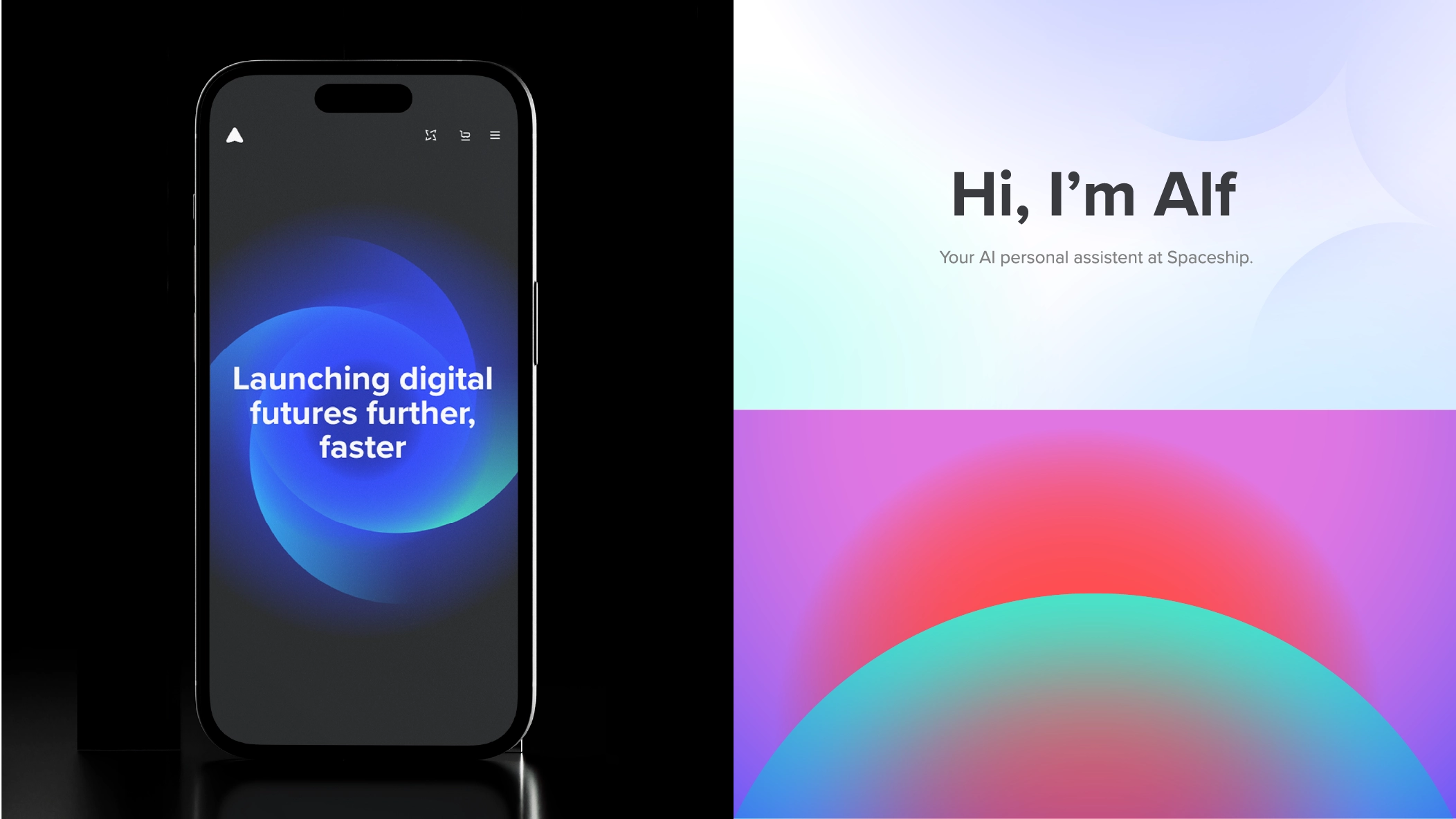
Un sistem care se adaptează
Folosind paleta noastră de culori pentru mod luminos și întunecat, elementele de ideografie sunt adaptate și ajustate pentru a funcționa în ambele medii.


Element pentru mod luminos „Excite and Inspire”.

Conversie directă a culorii pentru mod întunecat.

Folosește o culoare strălucitoare pentru a transmite mesajul „Excite and Inspire”.
Ghidaj
Iată câteva exemple de ce să eviți atunci când folosești caracterele noastre de bază pentru a compune ideograme.

Nu aplica acțiuni Pathfinder precum Merge, Subtract, Crop sau operațiuni similare.

Nu deforma caracterele în niciun fel.

Nu schimba opacitatea, nu aplica moduri de amestecare sau efecte asupra caracterelor.

Nu aplica contururi caracterelor.

Nu amesteca grupuri de culori diferite și nu folosi culori din afara paletei definite Spaceship.

Nu folosi excesiv caracterele cu culoare solidă.