Minh họa vi mô
Được sử dụng để truyền đạt thông điệp thực tiễn đồng thời duy trì tác động thị giác mạnh mẽ.

Dựa trên sự rõ ràng, cân bằng với cảm xúc và được hình thành qua hình học, các minh họa vi mô mang ý tưởng thành hình thức theo cách vừa trực quan vừa gần gũi với con người.
Kết cấu
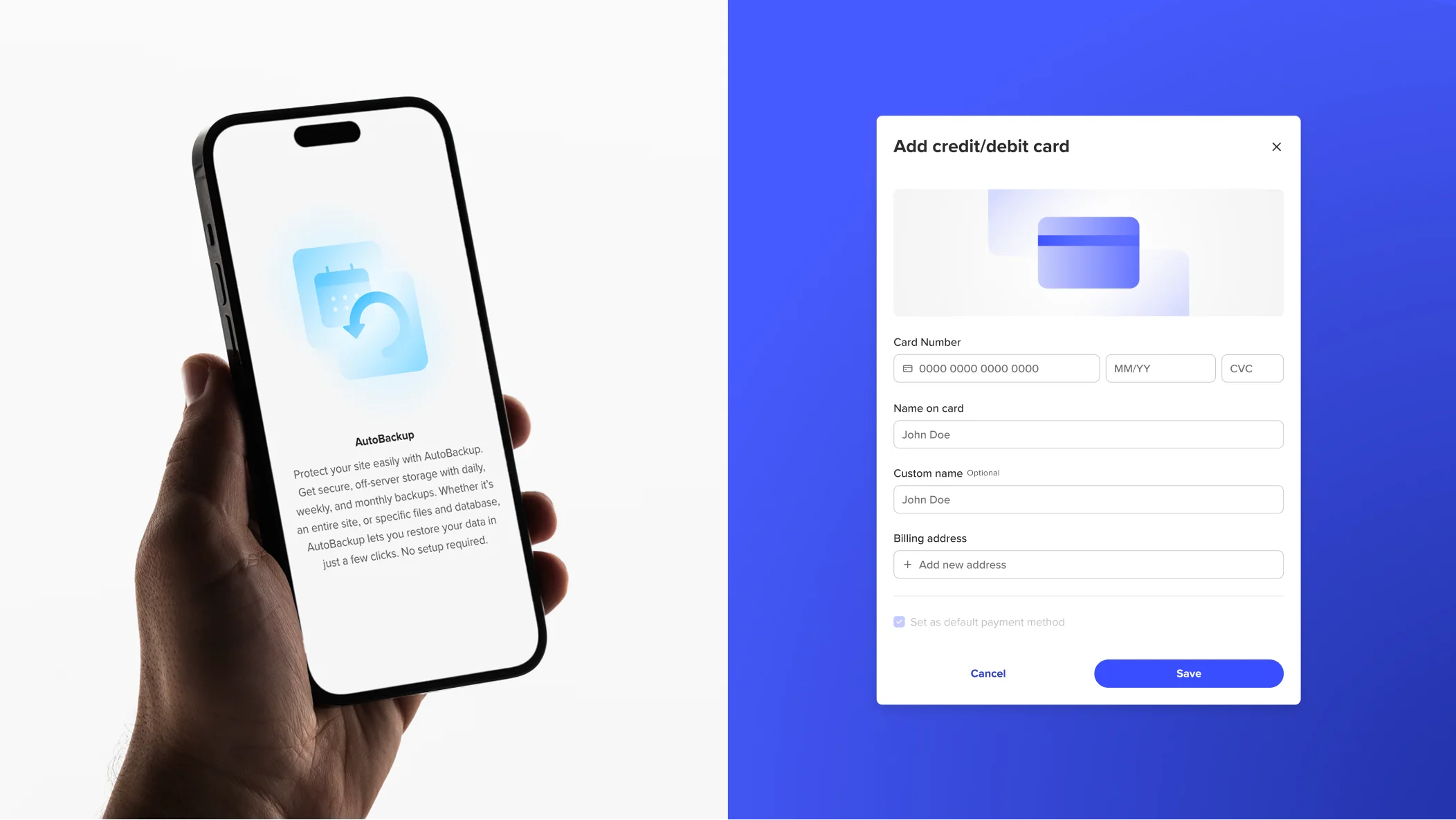
Minh họa vi mô kết nối khoảng cách giữa biểu tượng và ý đồ, truyền tải ý nghĩa chức năng qua phong cách hình ảnh nhất quán. Các hình học đơn giản làm nền cho việc mô tả vật thể, dịch vụ hoặc thiết bị, trong khi các ý đồ trừu tượng truyền đạt hành động, trạng thái và thuộc tính. Điều này tạo nên bố cục cân bằng, có chủ đích, rõ ràng và đặc trưng Spaceship.

Màu sắc
Màu sắc là yếu tố then chốt để tạo sự hài hòa và tương phản, thu hút sự chú ý của người dùng và thiết lập tâm trạng cho nền tảng của chúng tôi.
Màu cảm xúc
Để tạo tác động cảm xúc, chúng tôi có thể thử nghiệm với nhiều sự kết hợp trong một nhóm màu cụ thể, như màu thương hiệu hoặc sản phẩm. Tuy nhiên, chúng tôi tránh pha trộn các nhóm màu, ngoại trừ SPS Gray, có thể kết hợp với bất kỳ màu nào.

Màu chức năng
Để tăng cường chức năng, chúng tôi sử dụng các màu chính của thương hiệu Spaceship hoặc màu của sản phẩm cụ thể kết hợp với màu xám để có vẻ ngoài sạch sẽ hơn.

Màu thông báo
Đối với các minh họa vi mô thông báo, chức năng cũng là yếu tố then chốt. Vì vậy, chúng tôi tuân thủ các màu thông báo tiêu chuẩn, cũng như SPS Blue và Gray.

Hướng dẫn
Dưới đây là một số ví dụ về những điều nên tránh khi tạo và sử dụng minh họa vi mô.

Các yếu tố chức năng không nên quá phức tạp, hình tượng, thực tế hoặc trẻ con, mà nên sạch sẽ, đơn giản và hình học.

Không làm phức tạp hóa bố cục. Hãy tập trung vào thông điệp chính và cảm xúc thiết yếu bạn muốn truyền tải.

Không pha trộn nhiều màu thông báo. Chỉ kết hợp từng màu thông báo riêng lẻ với SPS Gray.