Typografia
Środowisko typograficzne Spaceship wykorzystuje dwa kroje pisma: przyjazny i techniczny Gotham Rounded oraz prostszy i bardziej geometryczny Proxima Nova.
Typografia Spaceship jest pewna siebie i przejrzysta, umożliwiając przyjazny i konwersacyjny ton w komunikacji z naszymi odbiorcami.
Czcionka podstawowa
Gotham Rounded to przyjazny, a zarazem wyrafinowany krój pisma. Jest używany wyłącznie w logo Spaceship, submarkach produktów oraz identyfikacjach zespołu. Dozwolone są tylko grubości medium, book i light.

Czcionka dodatkowa
Proxima Nova to kluczowy element środowiska graficznego Spaceship. Jest głównym krojem pisma we wszystkich komunikatach. Dozwolone są tylko grubości bold, medium, regular i light podczas pracy z tym krojem.

Skala
System skali typograficznej i niezbędne kroki rozmiarowe zostały zbudowane i określone przy użyciu Złotego Podziału (1:1,618).Stworzyliśmy kompletny zestaw skali typograficznej z kalkulatorem skali typograficznej na podstawie głównego rozmiaru bazowego. Ponieważ Złoty Podział powoduje duże skoki między rozmiarami, wymagany jest drugi rozmiar bazowy (2 razy większy od podstawowego), aby uzyskać bardziej optymalny zakres. Przykład poniżej pokazuje skalę typograficzną opartą na rozmiarach bazowych 16px i 32px.

Style tekstu
Proxima Nova zapewnia maksymalną optyczną spójność zarówno w małym tekście głównym, jak i dużych nagłówkach. Szeroki zakres grubości sprawia, że nadaje się do każdego tonu lub przekazu. Preferowane jest wyrównanie do lewej, choć w razie potrzeby można użyć wyrównania do środka.

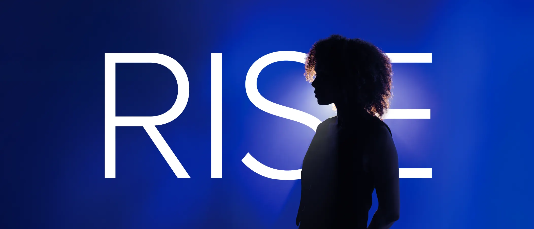
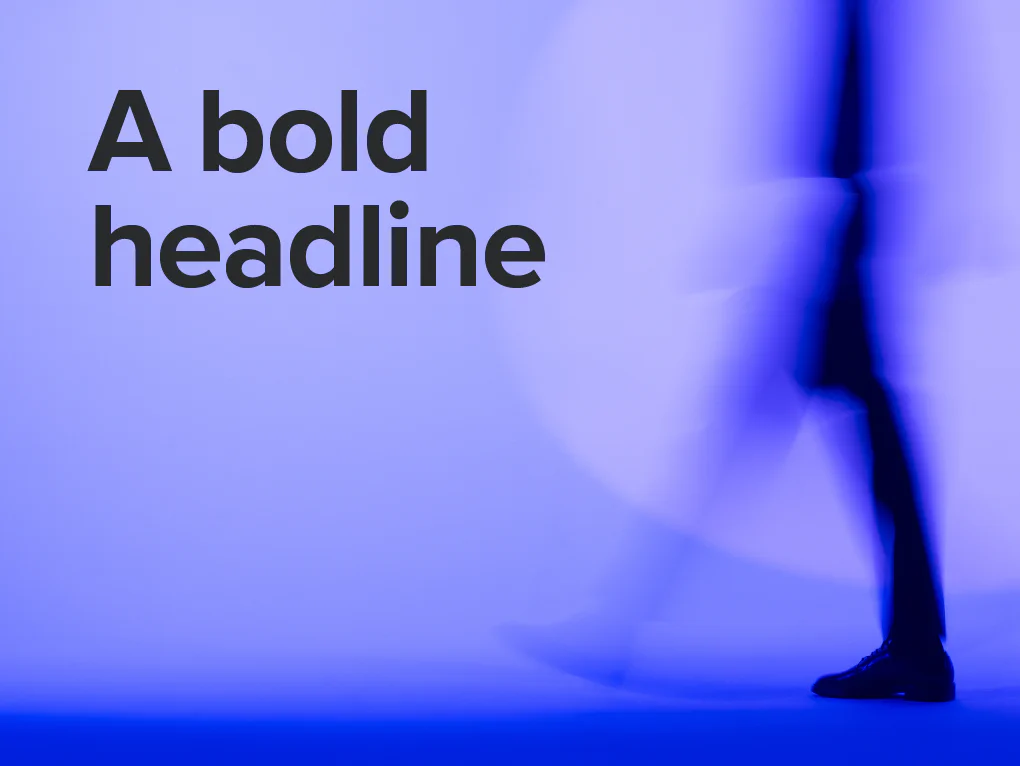
Dla dużych nagłówków używaj pogrubienia, optycznego kerningu, automatycznego interlinii i 80% odstępu między wyrazami.

Dla zwykłych nagłówków używaj pogrubienia, optycznego kerningu, automatycznego interlinii i 80% odstępu między wyrazami.

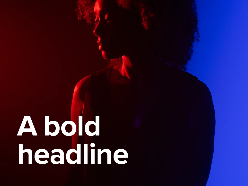
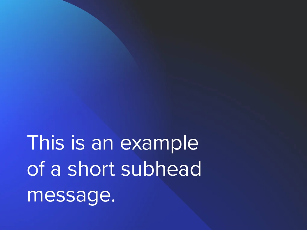
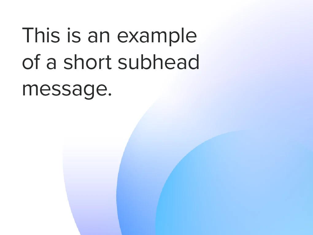
Dla krótkich podtytułów używaj średniej lub zwykłej grubości, optycznego kerningu, automatycznego interlinii i 100% odstępu między wyrazami.

Dla długich podtytułów używaj średniej lub zwykłej grubości, optycznego kerningu, automatycznego interlinii i 100% odstępu między wyrazami.

Dla akapitów używaj zwykłej lub cienkiej grubości, kerningu metrycznego, automatycznego interlinii i 100% odstępu między wyrazami.

Dla małego tekstu głównego używaj zwykłej lub cienkiej grubości, kerningu metrycznego, automatycznego interlinii i 100% odstępu między wyrazami.
Hierarchia typograficzna
Aby uzyskać skuteczną hierarchię treści, typografia powinna komunikować relacje organizacyjne między nagłówkami, podtytułami i tekstem głównym. Dobieranie odpowiednich grubości i rozmiarów tworzy silny kontrast wizualny i pomaga prowadzić czytelnika.

Bezpieczne marginesy
Używamy miary interlinii nagłówka jako odniesienia do odstępów między wierszami, aby zapewnić maksymalną czytelność i ustalić bezpieczne marginesy dla kolejnych bloków tekstu.

Kombinacje kolorów
Dozwolone są tylko kombinacje kolorów przedstawione poniżej podczas używania tekstu na jednolitych tłach kolorystycznych.


Tła
Kontrast i czytelność to kluczowe elementy, które należy brać pod uwagę przy umieszczaniu tekstu na obrazach lub kolorowych tłach.
Wskazówki
Oto kilka przykładów, czego unikać podczas pracy z tekstem.

Nie zmieniaj drastycznie zdefiniowanych wartości kerningu, odstępów między wyrazami i interlinii.

Pamiętaj o hierarchii: mocniejsze nagłówki, lżejsze podtytuły, teksty główne itd.

Nie używaj akapitów wyrównanych do prawej.

Nie używaj innych kolorów w żadnym tekście, takich jak kolory pomocnicze, produktowe czy submarek.

Używaj tylko białego lub ciemnoszarego tekstu na kolorowych tłach.
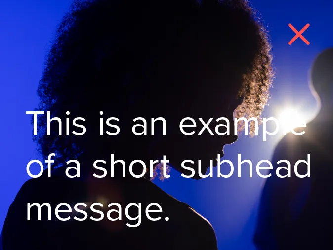
Czytelność jest kluczowa. Nie umieszczaj tekstu na złożonych obrazach lub tłach o podobnym odcieniu.