Logo
Spaceship’in logosu, görsel kimliğinin merkezinde yer alır ve çevrimiçi olmayı yeniden tanımlama amacını simgeler.

Akılda kalıcı ve ayırt edici olan logo, tüm alanlarda ve mecralarda marka tanınırlığını sağlar.
Sembol
Spaceship sembolü, günlük bir fare imlecinden ilham alınarak tasarlanmıştır. İmleç, interneti köprü metinler ve bağlantılar aracılığıyla keşfetmemizi sağlar ve bizi beklenmedik ve bilinmeyen dijital yerlere götürerek hayatımızı zenginleştirir.
Spaceship sembolü, eşit kenarlı temel bir üçgen şekilden oluşturulmuş olup, üçgenin boyutuna orantılı yuvarlatılmış köşelerle tamamlanmıştır.
Yerleşim
Logo yerleşimi, kelime işareti ile sembol arasındaki en iyi ilişkiye dayanır.
Yatay
Dikey
Renkler
Renk, bir marka kimliğindeki en önemli unsurlardan biridir. Markamızı ayırt eder ve tutarlı iletişim kurmamıza yardımcı olur.


Versiyonlar
Spaceship logosunun üç versiyonu vardır: mavi, koyu gri ve beyaz. Mavi versiyon beyaz arka planlarda tercih edilir, beyaz versiyon ise SPS Mavi veya koyu arka planlarda kullanılır. Koyu gri versiyon ise, özellikle belirtildiğinde, beyaz arka planlarda da kullanılabilir.


Güvenli boşluk
Güvenli boşluk, logonun okunabilirliğini ve etkisini garanti eder. Minimum alan, sembolün yüksekliği ve genişliğiyle eşittir (uygulanabildiğinde). Mümkün olduğunda logoya daha fazla alan bırakın.


Minimum boyut
Logo, okunabilirliğini koruyarak ekranda ve baskıda küçük boyutlara ölçeklenecek şekilde tasarlanmıştır. Yerleşim, iletişim türüne ve özel sınırlamalarına (ör. ikonlar, tabelalar, ürünler) bağlıdır.

Düz renkli arka planlar
Ana marka paleti dışındaki arka plan renklerinde yalnızca SPS Koyu Gri veya beyaz logo versiyonlarını kullanın. Logo ile arka plan rengi arasında her zaman güçlü bir kontrast olduğundan emin olun.


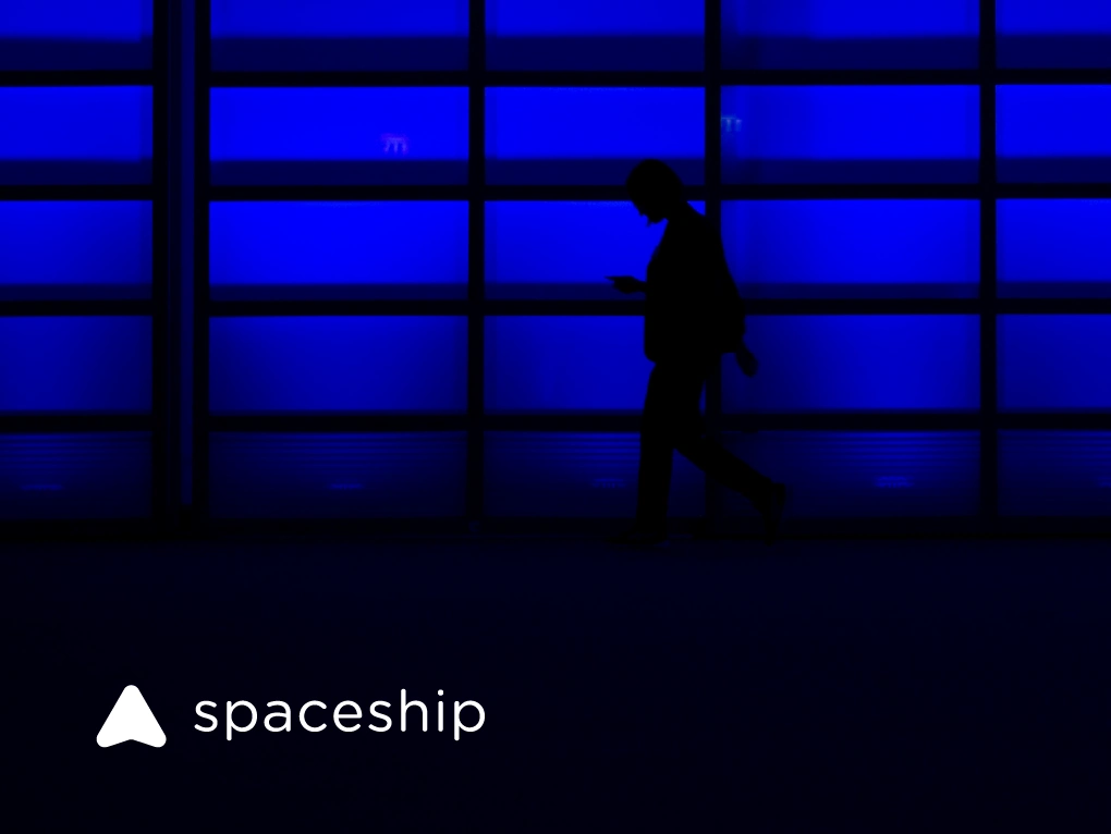
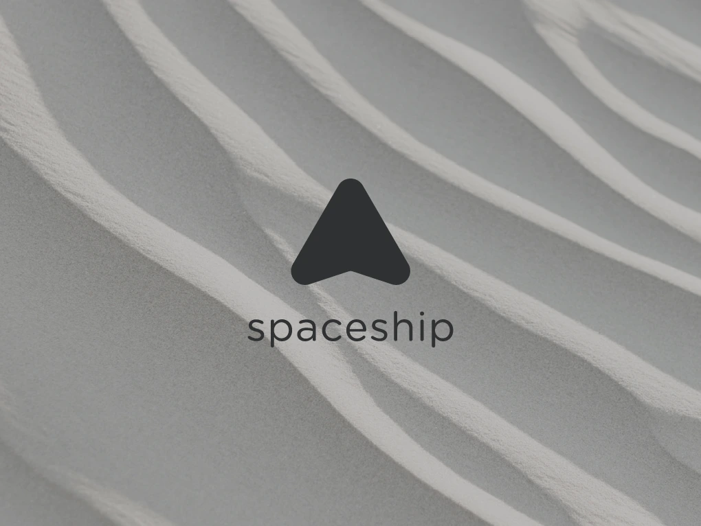
Görsel arka planlar
Spaceship logosu, tüm fotoğraf arka planlarında okunabilir olmalıdır. Düşük görsel gürültüye sahip alanlarda koyu gri veya beyaz versiyonları kullanın; arka plan görseliyle daha iyi kontrast sağlayan versiyonu seçin.


Yönergeler

Kelime işaretini yeniden oluşturmak için başka yazı tipleri kullanmayın.

Verilen yerleşimleri değiştirmeyin.

Öğeleri dönüştürmeyin.

Farklı renkler kullanmayın.

Kelime işaretinde başka renkler kullanmayın.

Degrade veya renk efektleri kullanmayın.