顏色
色彩是 Spaceship 品牌識別的重要元素。從視覺素材製作、企業資料到商品推廣,品牌色彩的一致運用至關重要。
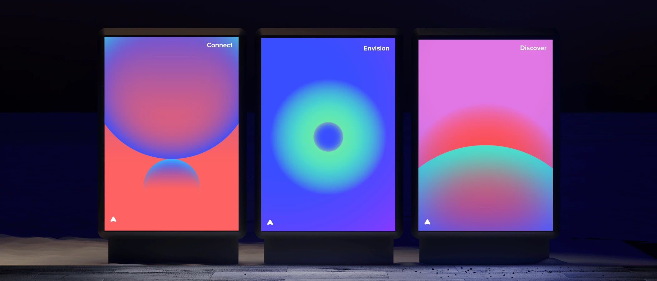
Spaceship 的品牌色彩旨在於我們的品牌表達中營造強烈的和諧感及多樣性。
品牌主色
我們特別為品牌主色調創造了 SPS Blue 和 SPS Dark Gray。SPS Blue 是主要色彩,而 SPS Dark Gray 則代表品牌較中性的部分。


品牌輔助色
輔助色調進一步擴展了我們品牌的個性。這些相應色調與 SPS Blue 接近,涵蓋了冷暖色系的範圍,與品牌的基礎色彩形成和諧。


色調與明暗變化
我們的系統以基礎色及相應的深淺變化構建。每種顏色亦有專屬的淺色及深色模式調色板。這些細節經過調整,讓資產能更好地適應及融合於特定模式。
