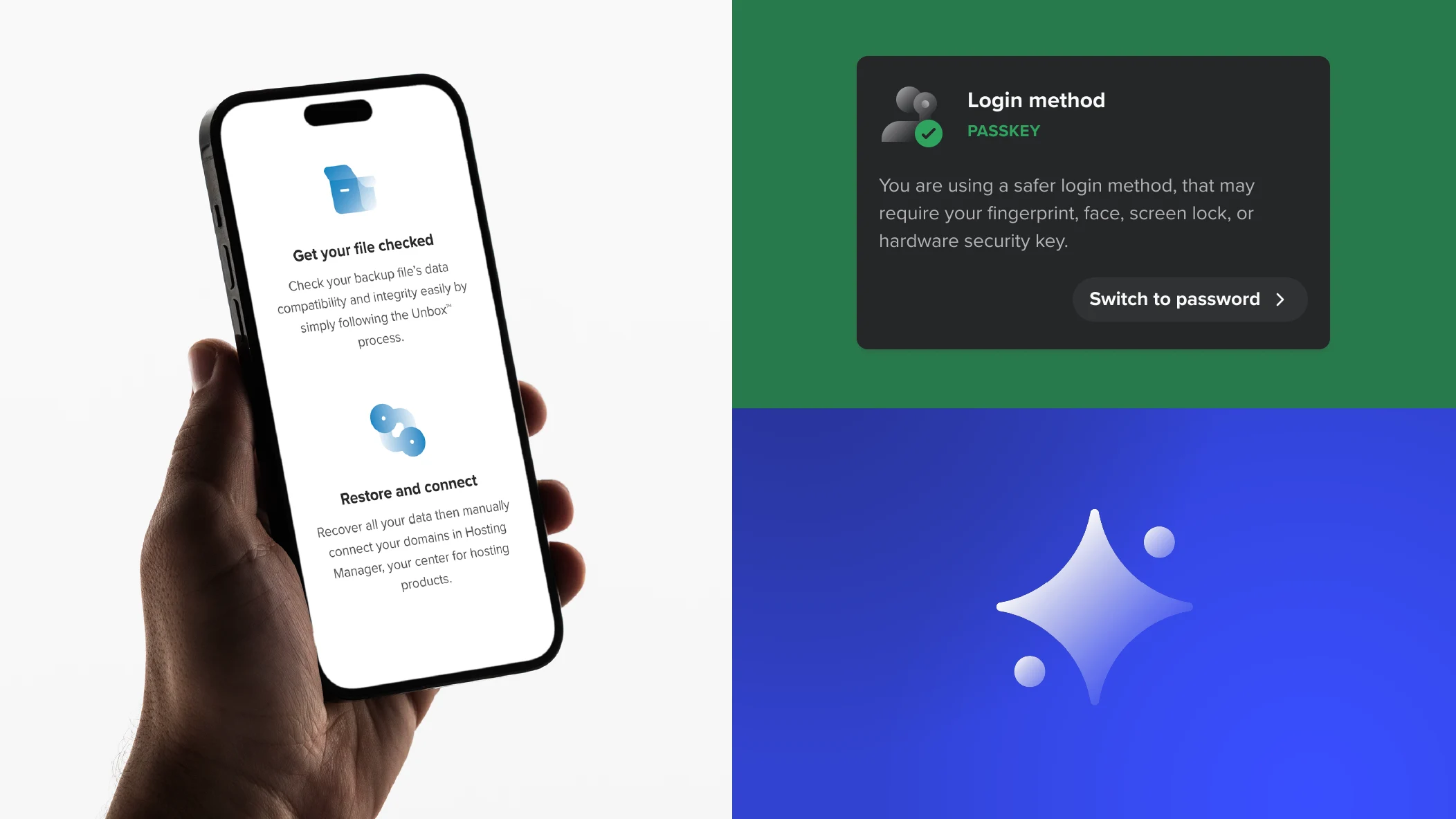
Pictogramas
Pequenos e simples elementos gráficos que aprimoram componentes-chave da web, comunicando ideias de forma rápida e eficaz.
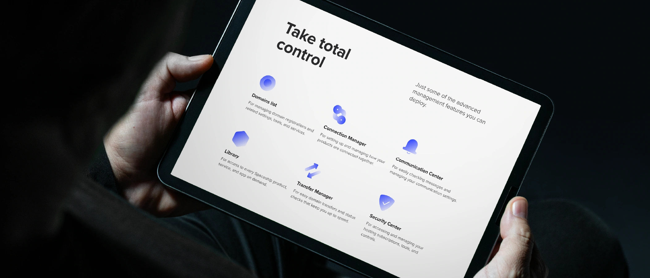
Literais, funcionais e geométricos — nossos pictogramas destilam ideias à sua forma mais pura, transmitindo propósito claro e simplicidade atemporal.
Tipo
Os pictogramas Spaceship vêm em dois tipos: regular e comp. O tipo comp combina um pictograma regular com um ícone da Biblioteca de Iconografia Spaceship, permitindo transmitir conceitos mais complexos e específicos.


Versões
Todos os pictogramas Spaceship estão disponíveis em duas versões: preenchida (primária) e contornada (secundária). A versão contornada deve ser usada apenas quando um pictograma precisar de menos peso visual do que pictogramas, textos ou componentes de interface próximos. Isso ajuda a estabelecer hierarquia visual em layouts complexos.

Construção
Pictogramas são baseados em um conjunto de regras, desde a grade base até parâmetros de gradiente e traço, para garantir resultados consistentes e equilibrados.

Tamanho
Os pictogramas Spaceship são projetados para serem escaláveis, mantendo a consistência visual e garantindo a melhor legibilidade. Existem cinco tamanhos de pictogramas em nosso sistema de design.

Cores
Pictogramas geralmente usam um único tom. A única exceção é o tipo comp, que pode incluir cores da marca ou de notificação, sobre as quais você encontrará mais informações abaixo. Para garantir consistência em contextos de interface, os pictogramas seguem as referências de cores do Spaceship Design System.
Cor padrão
Cinza é a cor padrão para pictogramas e deve ser usada para representar mensagens, ações ou funcionalidades. Em casos excepcionais, também pode ser usada para produtos. Pictogramas contornados estão disponíveis apenas na cor padrão.

Cores da marca
SPS Blue, SPS Dark Gray ou branco também podem ser usados no lugar da cor padrão quando for necessário mais impacto visual ou para reforçar a identidade Spaceship. Consulte a página de cores para mais detalhes.

Cores do produto
A cor principal do produto deve ser usada para pictogramas em contextos dedicados ao produto (páginas de produto, cartões de produto, etc.) para todos os produtos atuais e futuros.

Cores de notificação
Essas cores devem ser usadas para reforçar uma mensagem de notificação. A versão comp deve ser usada apenas em mensagens genéricas do sistema e não em estados de alerta.

Orientações
Aqui estão alguns exemplos do que evitar ao criar e usar pictogramas.

Não permita que elementos-chave do pictograma regular fiquem no canto inferior direito.

Não use gradientes complexos ou multicoloridos em versões preenchidas.

Não misture elementos preenchidos e contornados no tipo comp.

Não use outras cores nas versões preenchidas além das identificadas acima.

Não use nenhuma cor nas versões contornadas além da cor padrão.

Não combine a cor padrão com nenhuma cor além da cor primária da marca Spaceship e das cores de Notificação.