表意文字
Spaceship 以意符傳達簡單明確的理念。我們避免複雜敘事或字面描繪,而是專注於以簡單幾何和動感表達訊息的核心意義。

Spaceship 的意象設計融合了直覺與系統化,在保持簡約與優雅的同時,亦開放於演變。
核心形狀
我們的意象設計以三種核心形狀為基礎:圓形、方形和三角形。簡約與幾何本質是品牌 DNA 的重要部分,這些基本形狀為建立新圖像提供了共同基礎。

字母
我們從三種核心形狀創造出自己的字母。這些字符是品牌視覺傳達系統的基石。組合方式無窮無盡,讓我們能創造任何視覺效果以滿足 Spaceship 的品牌需求。

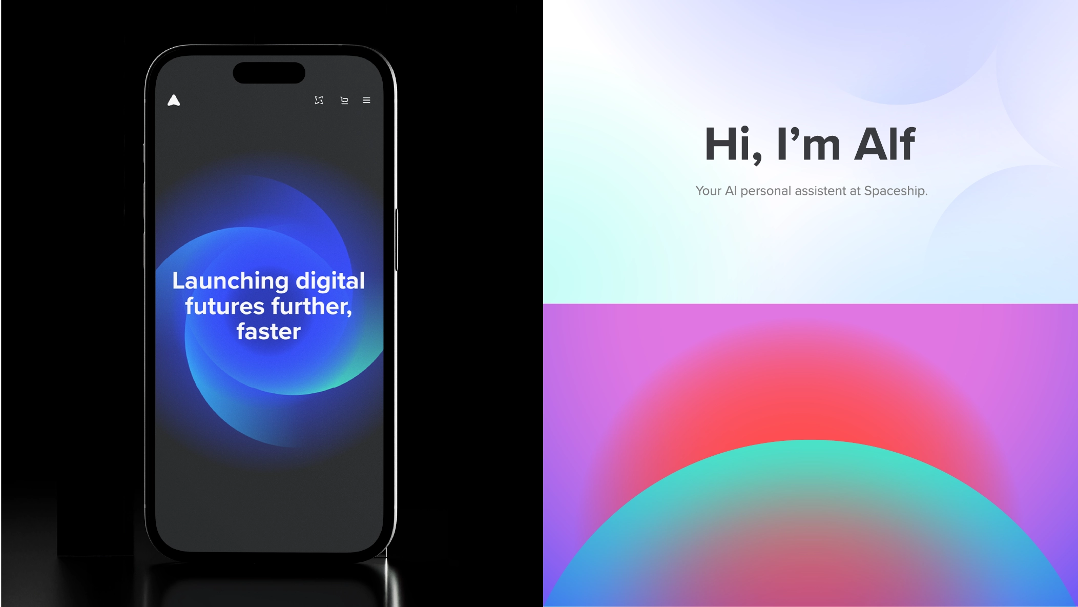
意符
結合兩個或以上字符,可創造獨特且易於理解的意念和概念表達。這是一種超越語言障礙、歷久常新的溝通方式。

詞彙
當訊息較為複雜時,我們可以探索更豐富的視覺方案,但始終以簡單幾何和動感為本。
構圖
我們追求視覺元素之間的和諧與平衡——既避免過於簡單的解決方案,也避免對構圖作出不必要的添加。

顏色
Spaceship 意象設計中的用色遵循品牌色系結構,分為三組:品牌色、產品色及通知色。每組均包含基礎色及其色調、明暗變化,以及淺色和深色模式版本。
品牌色
一般 Spaceship 意象設計組合應使用品牌色板中的主色或輔助色。詳情請參閱色彩頁面。

產品色
Domains、Hosting、Security 及 Email 的意象設計組合應只使用相應類別的色板。SPS Dark Gray 可與各類別色彩搭配使用。

通知色
通知色彩與 Spaceship 設計系統中既定的色彩參考一致,確保平台一致性及清晰度,讓用戶能迅速理解每則訊息的意圖。

可適應的系統
透過深色與淺色調色板,意象設計素材可因應不同模式作出調整。


淺色模式「激發與啟發」素材。

直接轉換為深色模式色彩。

使用鮮明色彩傳達「激發與啟發」的信息。
指引
以下是使用我們核心字符組合意象時應避免的例子。

請勿對字符進行如合併、減去、裁剪等 Pathfinder 操作。

請勿以任何方式扭曲字符。

請勿更改字符的不透明度、套用混合模式或效果。

請勿為字符加上外框。

請勿混用不同色組或使用 Spaceship 色板以外的顏色。

請勿過度使用純色字符。