排版
Spaceship 的字体环境采用了两种字体:友好且技术感的 Gotham Rounded,以及更简洁、更几何化的 Proxima Nova。
Spaceship 的字体设计自信且直接,使我们能够以友好和对话的语气与受众交流。
主字体
Gotham Rounded是一款友好且精致的字体。它仅用于 Spaceship 标志、产品子品牌和团队身份。仅允许使用中等、书籍和细体字重。

辅助字体
Proxima Nova是 Spaceship 图形环境的关键元素。它是所有沟通的主要字体。使用该字体时,仅允许粗体、中等、常规和细体字重。

比例
字体比例系统及所需的尺寸步进是基于黄金比例(1:1.618)构建和确定的。我们基于主基准尺寸创建了完整的字体比例集,并配有字体比例计算器。由于黄金比例会造成尺寸之间的较大跳跃,因此需要一个次级基准尺寸(为基准尺寸的 2 倍)以生成更理想的范围。下方示例展示了基于 16px 和 32px 基准尺寸的字体比例。

文本样式
Proxima Nova 在小号正文字体和大标题中都具有极高的光学一致性。其丰富的字重选择使其适用于任何语气或信息。建议使用左对齐文本,但在必要时也可使用居中对齐。

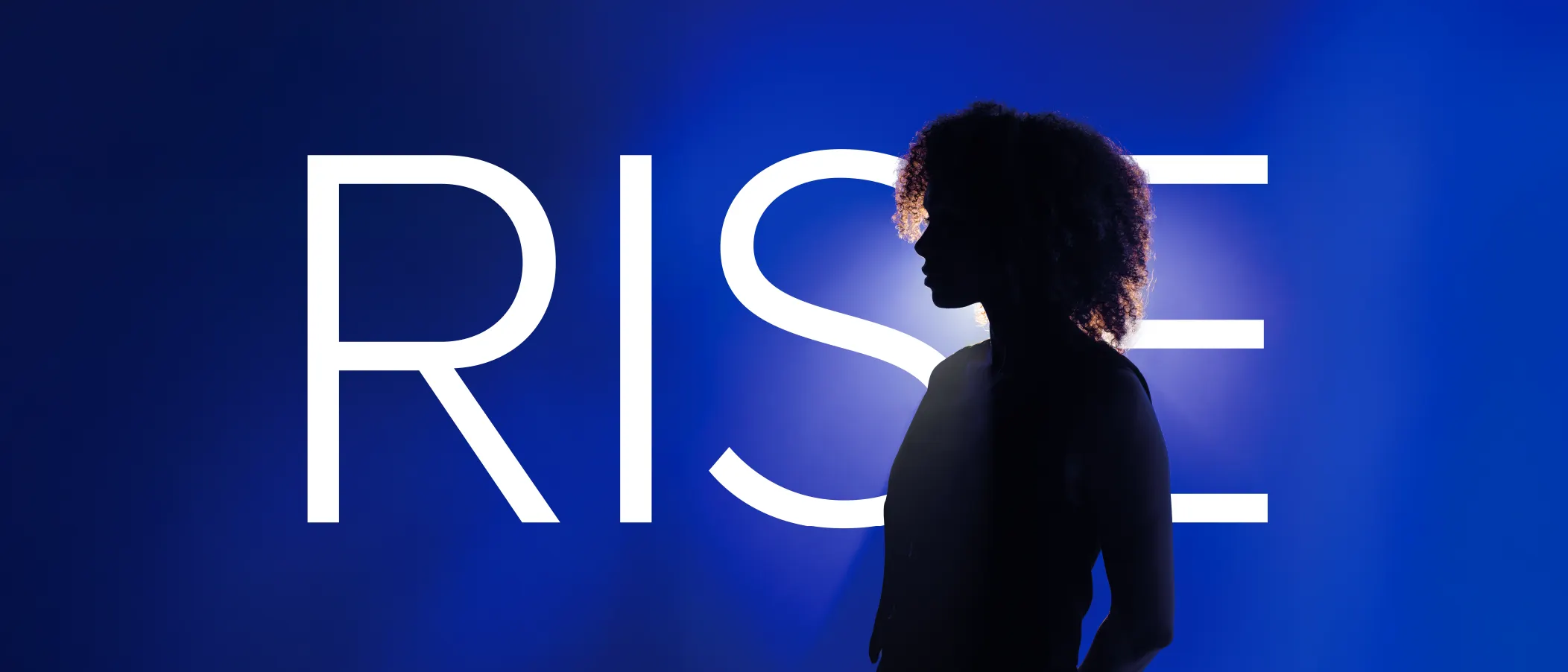
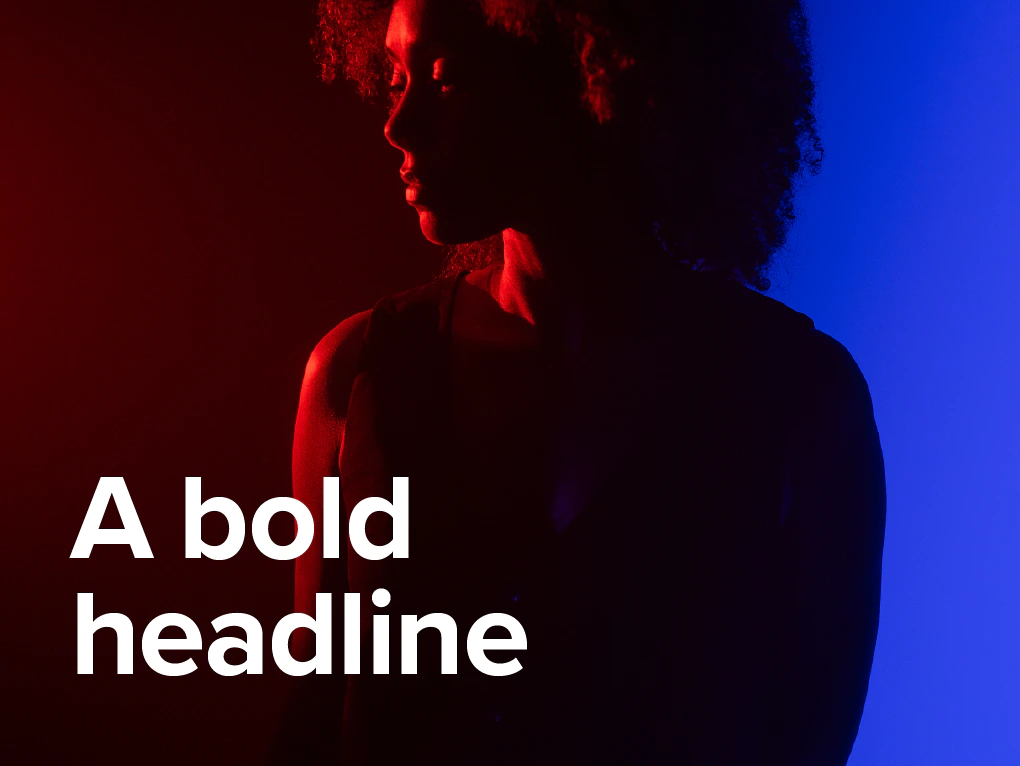
对于大标题,请使用粗体字重、光学字距调整、自动行距和 80% 的字间距。

常规标题请使用粗体字重、光学字距调整、自动行距和 80% 的字间距。

对于短副标题,请使用中等或常规字重,光学字距调整,自动行距和 100% 的字间距。

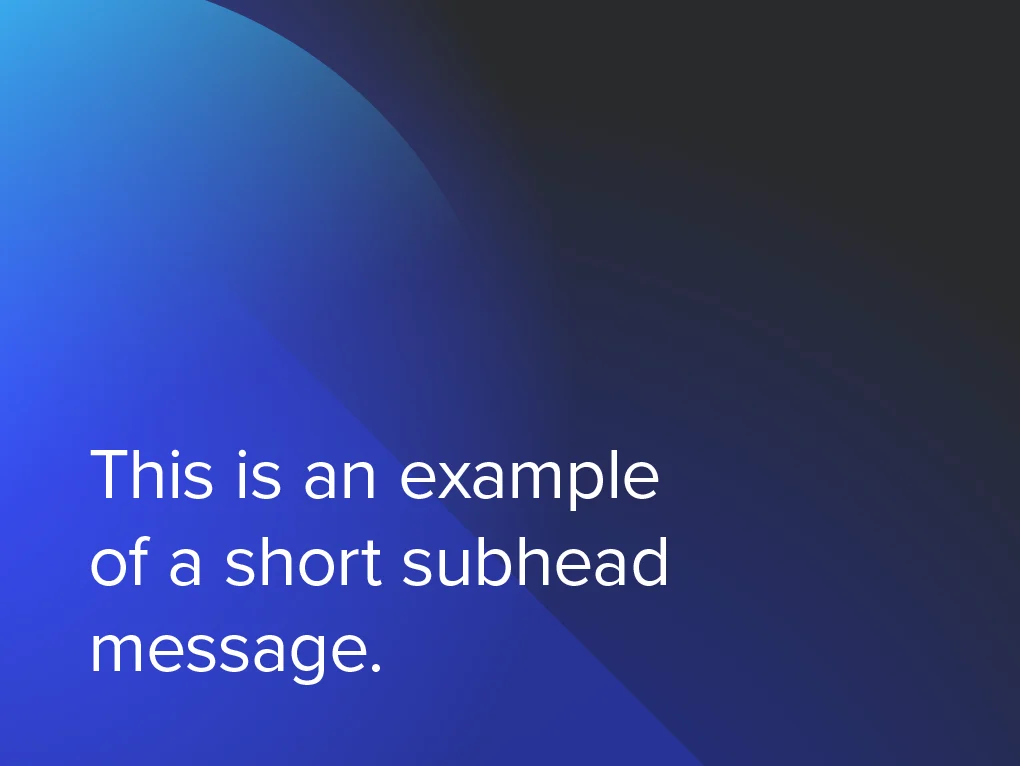
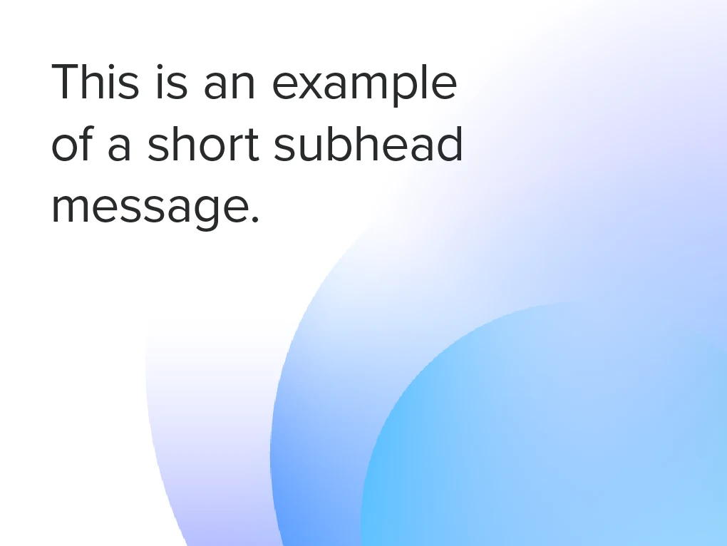
对于长副标题,请使用中等或常规字重,光学字距调整,自动行距和 100% 的字间距。

对于段落,请使用常规或细字体重,度量字距调整,自动行距和 100% 的字间距。

对于小号正文字体,请使用常规或细字体重,度量字距调整,自动行距和 100% 的字间距。
字体层级
为了实现有效的内容层级,字体应传达标题、副标题和正文之间的组织关系。正确搭配字重和字号可以营造强烈的视觉对比,帮助引导读者。

安全边距
我们使用标题的行距作为行间距参考,以确保最大可读性,并为后续文本块建立安全边距。

配色组合
在使用纯色背景的文本时,仅允许使用下方展示的配色组合。


背景
对比度和可读性是在图片或彩色背景上使用文本时需要考虑的关键要素。

指导
以下是处理文本时应避免的一些示例。

不要大幅更改已定义的字距、字间距和行距数值。

请牢记层级关系:更强的标题、更轻的副标题、正文等。

不要使用右对齐段落。

不要在任何文本上使用其他颜色,如辅助色、产品色或子品牌色。

仅可在彩色背景上使用白色或深灰色文本。
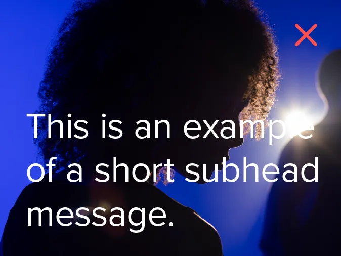
可读性至关重要。不要将文本放置在复杂的图片或色调相近的背景上。