Logo
Spaceship’s logo is at the core of its visual identity, symbolising the aim of redefining getting online.

Memorable and distinctive, the logo ensures brand recognition across all spaces and media.
Symbol
The Spaceship symbol is inspired by an everyday mouse cursor. The cursor lets us explore the internet through hypertext and hyperlinks, elevating our lives by taking us to unexpected and unknown digital places.
The Spaceship symbol is built from a basic triangle shape with equal sides, finished with rounded angles proportional to the size of the triangle.
Lockup
The logo lockup is based on the optimal relationship between the wordmark and the symbol.
Horizontal
Vertical
Colours
Colour is one of the most important elements in a brand identity. It distinguishes our brand and helps us to create consistent communication.


Versions
The Spaceship logo has three versions: blue, dark grey, and white. The blue version is preferred on white backgrounds, and the white version on SPS Blue or dark backgrounds. The dark grey version can also be used on white backgrounds, whenever it is specifically defined.


Safe margin
The safe margin ensures the logo's legibility and impact. The minimum space is equal to the symbol's height and width (when applicable). Give the logo more space whenever possible.


Minimum size
The logo is designed to scale to small sizes on screen and in print while maintaining legibility. The placement depends on the type of communication and its specific limitations (e.g. icons, signage, merchandising.)

Solid colour backgrounds
Only use the SPS Dark Grey or white logo versions when working with background colours outside the main brand palette. Always ensure a strong contrast between the logo and the background colour.


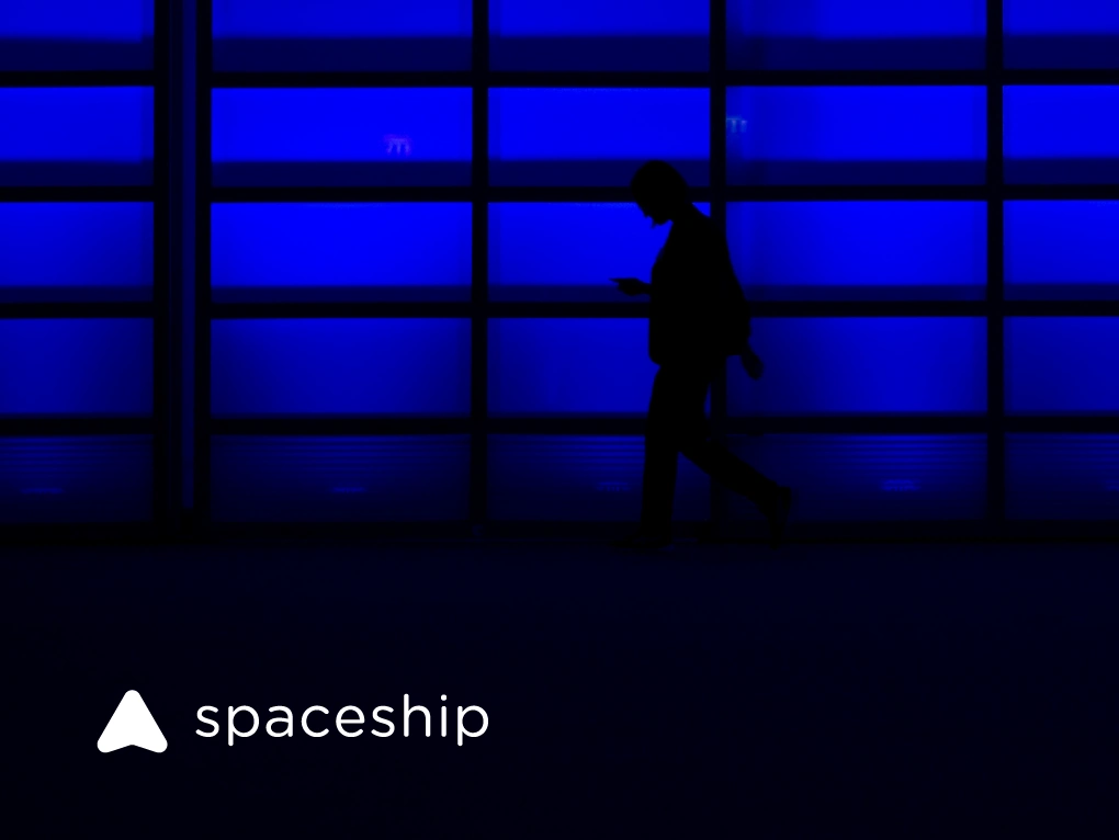
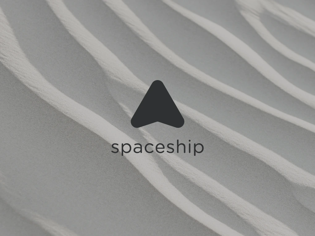
Image backgrounds
The Spaceship logo must be readable on all photographic backgrounds. Use the dark grey or white versions on areas with low visual noise, choosing the version that provides better contrast with the background image.


Guidance

Do not use other typefaces to re-create the wordmark.

Do not change the given lockups.

Do not transform elements.

Do not use different colours.

Do not use other colours in the wordmark.

Do not use gradients or colour effects.