Micro illustrations
Used to convey practical messages while maintaining a strong visual impact.

Grounded in clarity, balanced with emotion, and shaped through geometry, micro illustrations give form to ideas in a way that feels both intuitive and human.
Construction
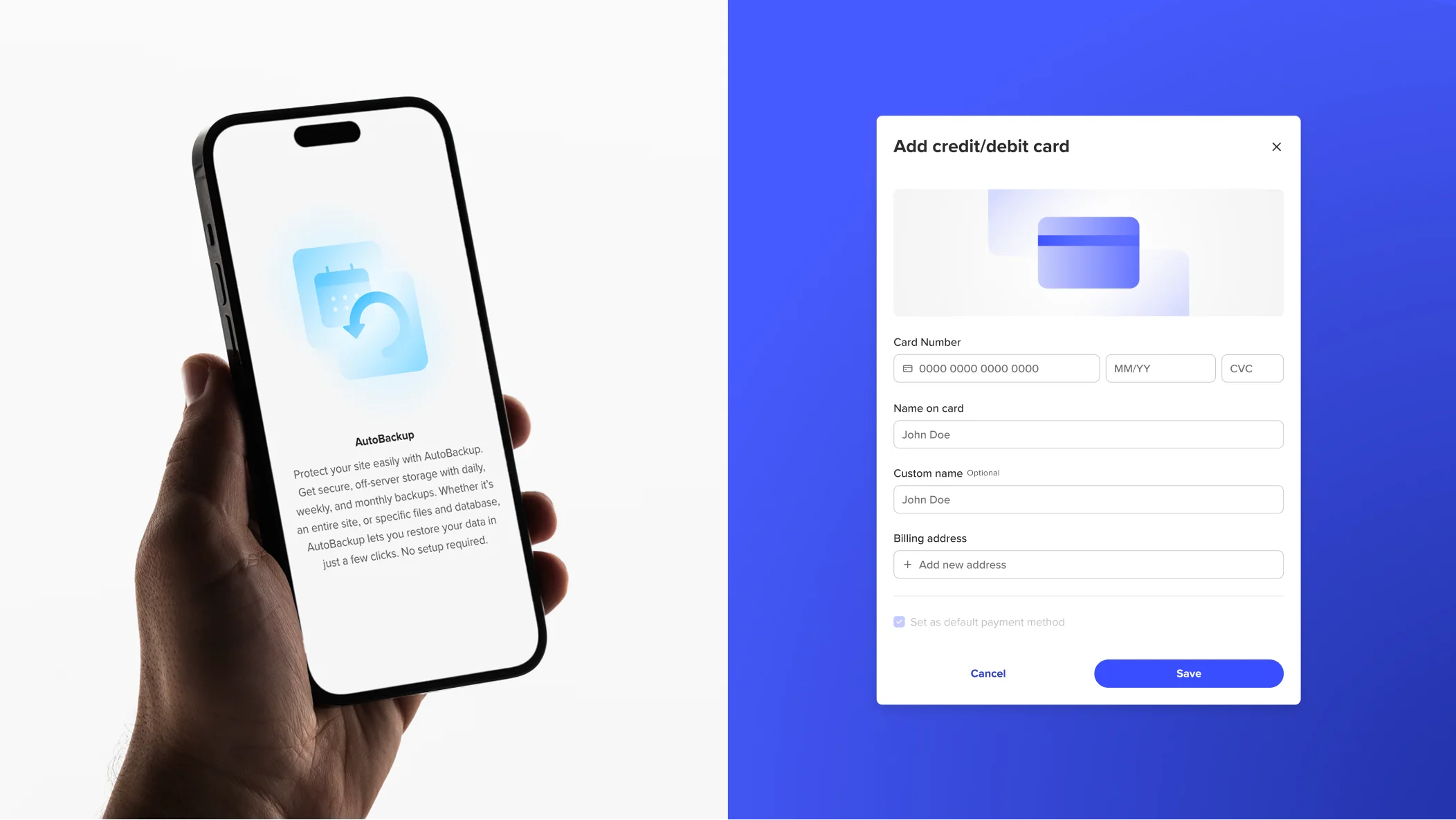
Micro illustrations bridge the space between pictograms and ideography, carrying functional meaning through a consistent visual voice. Simple geometric shapes ground the depiction of objects, services, or devices, while abstract ideograms convey actions, states, and properties. This creates balanced compositions that feel intentional, clear, and distinctly Spaceship.

Colours
Colour is a key element to create harmony and contrast, grabbing user attention and setting the mood for our platform.
Emotional colours
For emotional impact, we can experiment with various combinations within a specific colour group, such as brand or product. However, we avoid mixing colour groups, apart from SPS Grey, which can be combined with any colour.

Functional colours
For enhanced functionality, we use the main colours of the Spaceship brand or a particular product’s colours combined with grey for a cleaner appearance.

Notification colours
For notification micro illustrations, functionality is also key. So we stick to the standard notification colours, as well as SPS Blue and Grey.

Guidance
Here are some examples of what to avoid when creating and using micro illustrations.

Functional elements should not be too intricate, figurative, realistic, or childish, but clean, simple, and geometric.

Do not overcomplicate compositions. Focus on the main message and the essential feeling you wish to convey.

Do not mix several notification colours. Only pair individual notification colours with SPS Grey.