Pictograms
Small, simple graphical assets that enhance key web components, communicating ideas quickly and effectively.
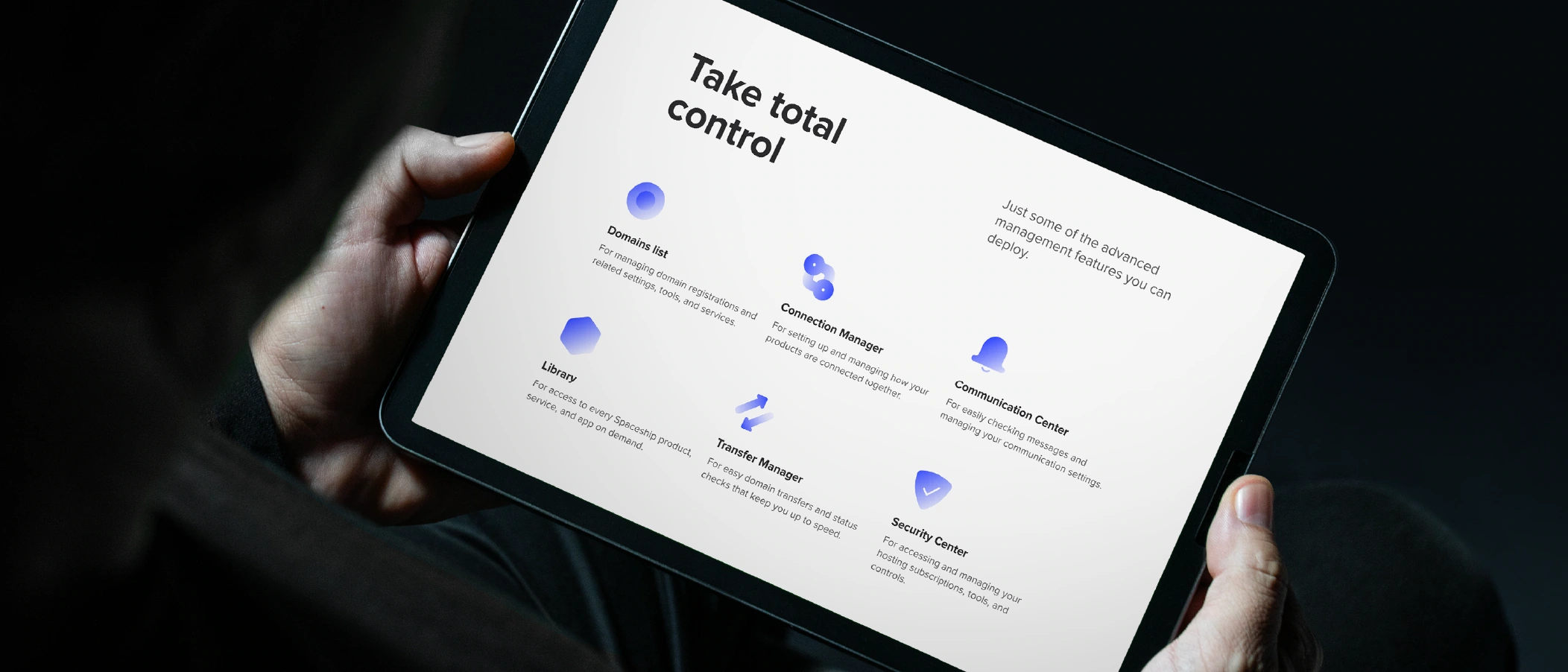
Literal, functional, and geometric — our pictograms distil ideas to their purest form, conveying clear purpose and timeless simplicity.
Type
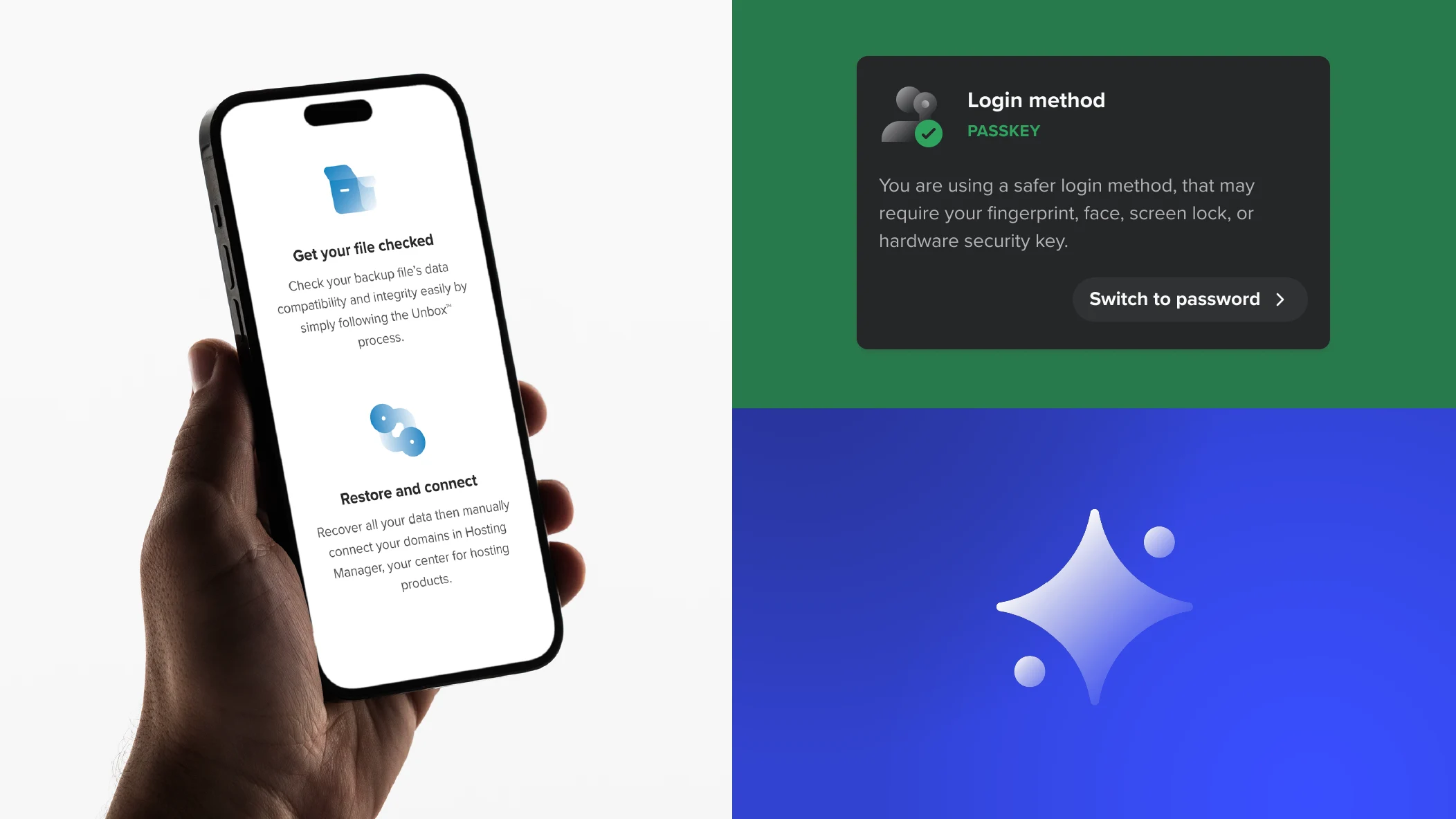
Spaceship pictograms come in two types: regular and comp. The comp type combines a regular pictogram with an icon from Spaceship’s Iconography Library, allowing us to convey more complex and particular concepts.


Versions
All Spaceship pictograms are available in two versions: filled (primary) and outlined (secondary). The outlined version should only be used when a pictogram needs less visual weight than nearby pictograms, text, or UI components. This helps establish visual hierarchy in complex layouts.

Construction
Pictograms are based on a set of rules, from base grid to gradient and stroke parameters, to ensure consistent and balanced results.

Size
Spaceship pictograms are designed to be scalable, maintaining visual consistency and ensuring the best legibility. There are five pictogram sizes in our design system.

Colours
Pictograms generally use a single hue. The only exception is the comp type, which may include brand or notification colours, for which you’ll find more information below. To ensure consistency in UI contexts, pictograms follow the Spaceship Design System colour references.
Default colour
Grey is the default colour for pictograms and should be used to represent messages, actions, or features. In exceptional cases, it may also be used for products. Outlined pictograms are only available in the default colour.

Brand colours
SPS Blue, SPS Dark Grey, or white, may also be used in place of the default colour when more visual impact is needed or to reinforce the Spaceship identity. Check out the colour page for further details.

Product colours
The main product colour should be used for pictograms in product-dedicated contexts (product pages, product cards, etc) for all current and upcoming products.

Notification colours
These colours should be used to reinforce a notification message. The comp version should only be used in generic system messages and not in warning states.

Guidance
Here are some examples of what to avoid when creating and using pictograms.

Do not allow key elements of the regular pictogram to fall on the lower right corner.

Do not use complex or multicoloured gradients in filled versions.

Do not mix filled and outlined elements in the comp type.

Do not use other colours in the filled versions besides the ones identified above.

Do not use any colour on outlined versions besides the default colour.

Do not combine the default colour with any colour besides the Spaceship brand primary and Notification colours.